Blog
Hi! My name is Martijn and this is my blog!
Hi! My name is Martijn and this is my blog!
Martijn Luinstra 26 Mar 2021
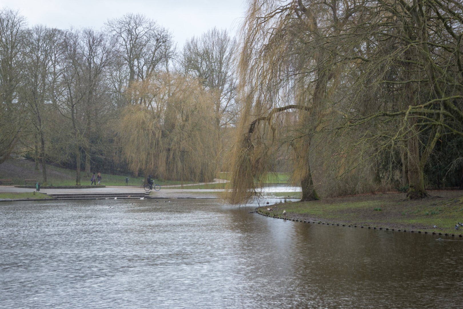
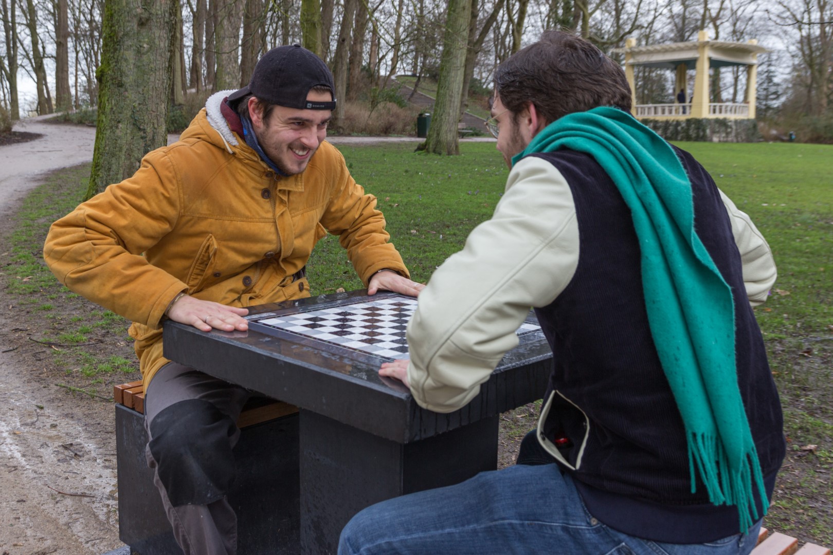
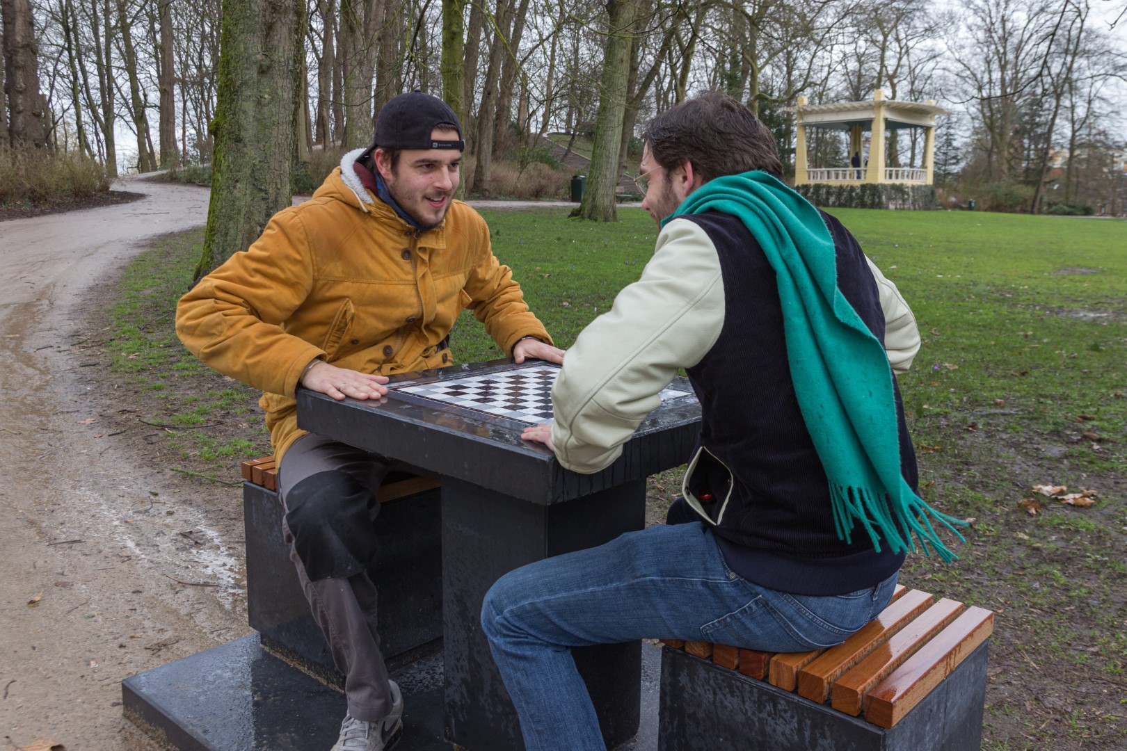
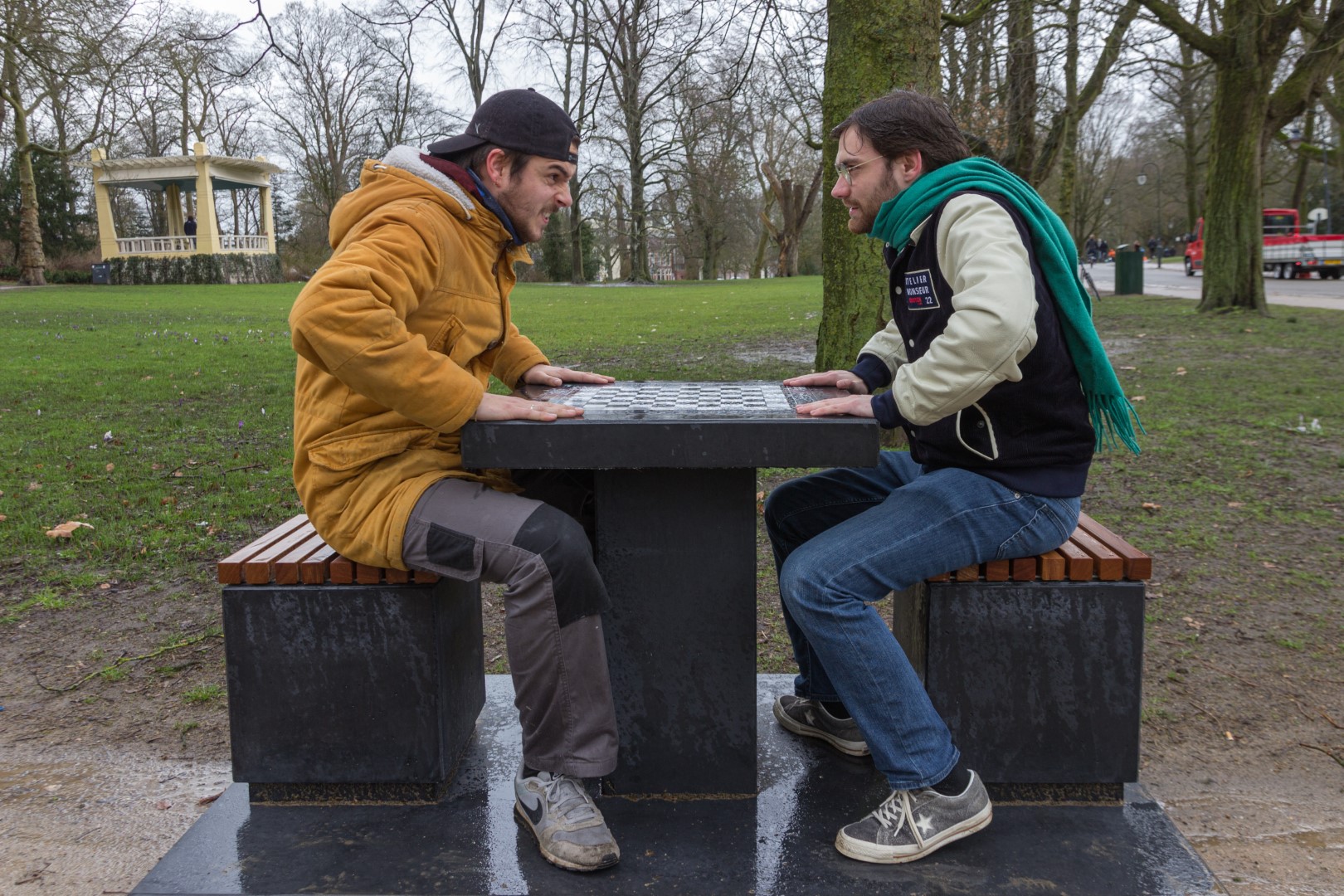
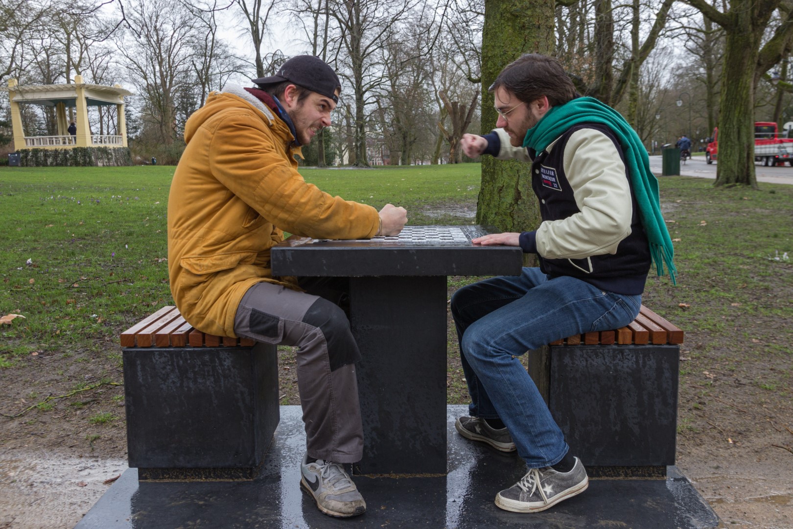
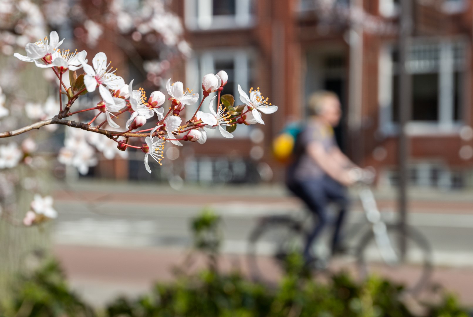
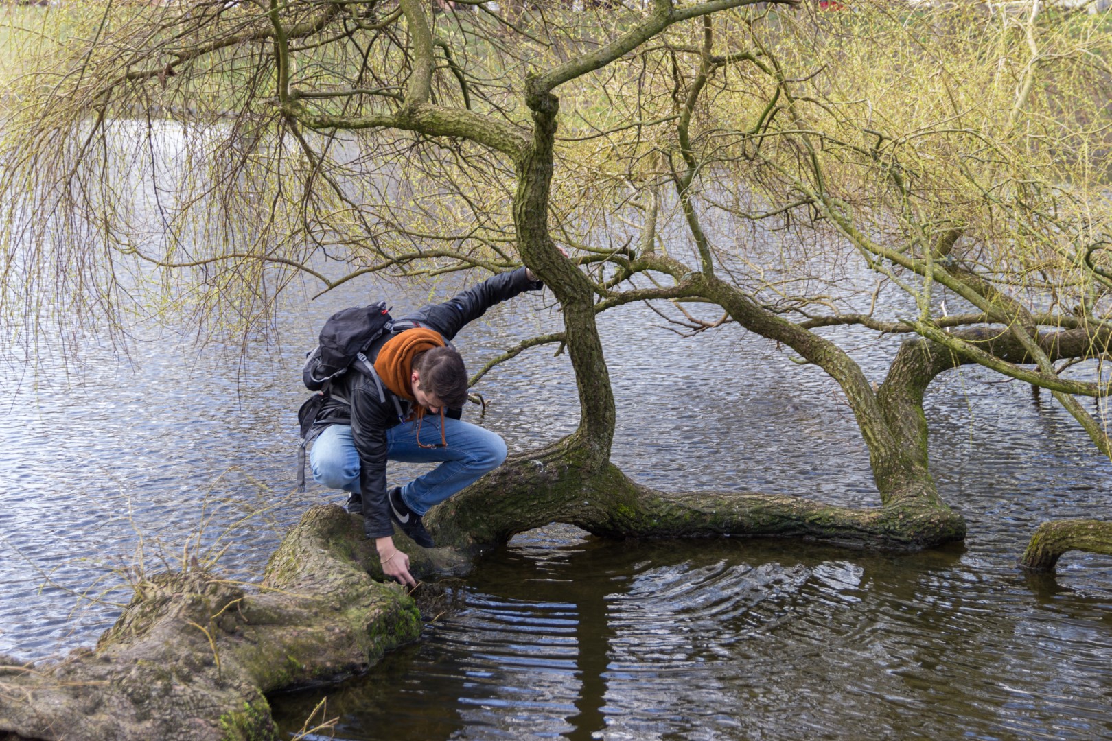
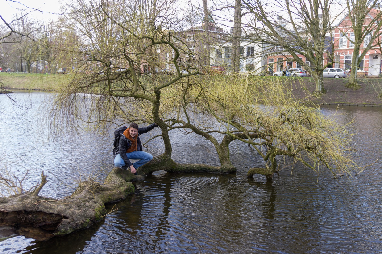
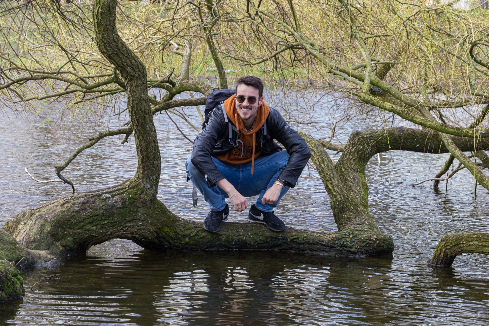
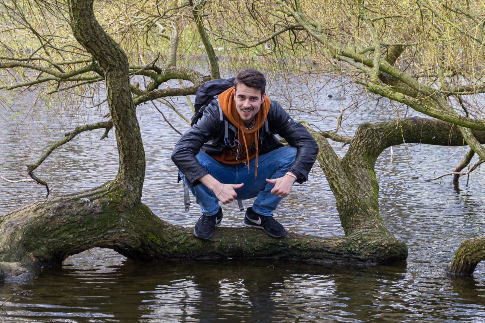
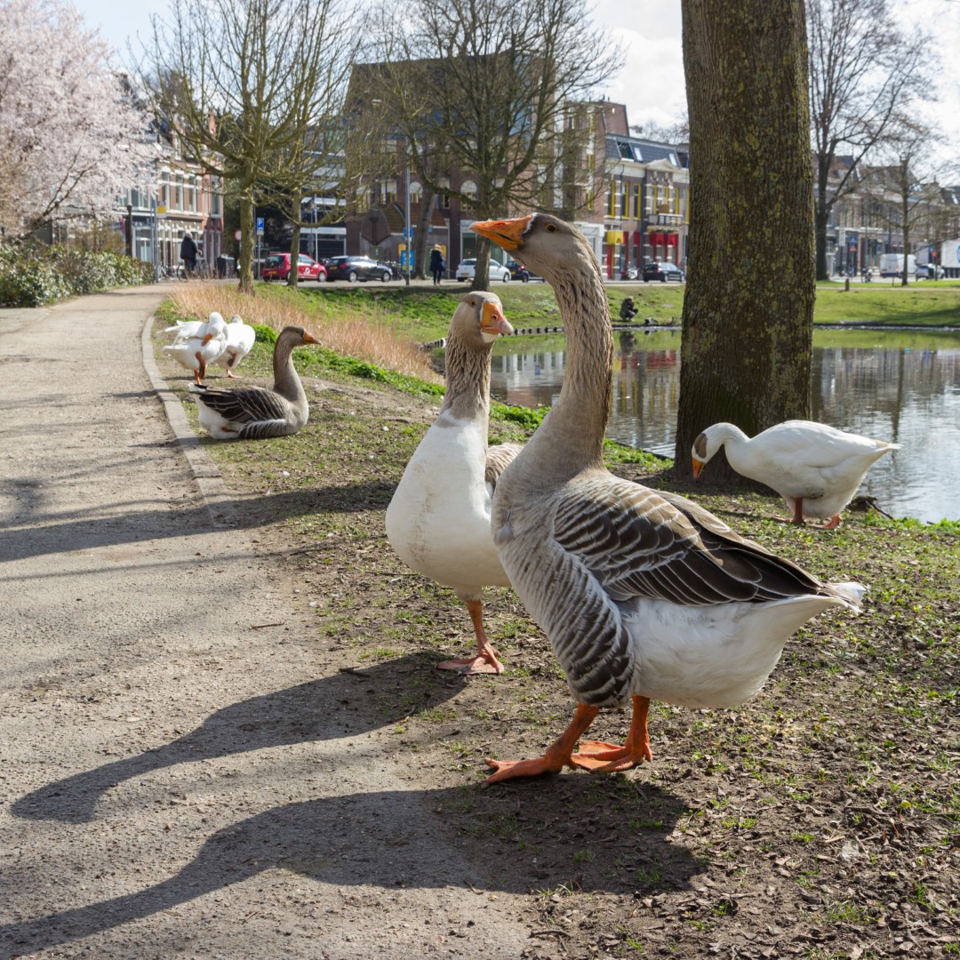
Sometimes you need to take a walk. During the lunch breaks of the “Design” lectures, Nivard, Jochem and I like to go on a walk in the Noorderplantsoen. Sometimes, I bring a camera. The following have been the results so far…
Martijn Luinstra 25 Mar 2021 3 comments
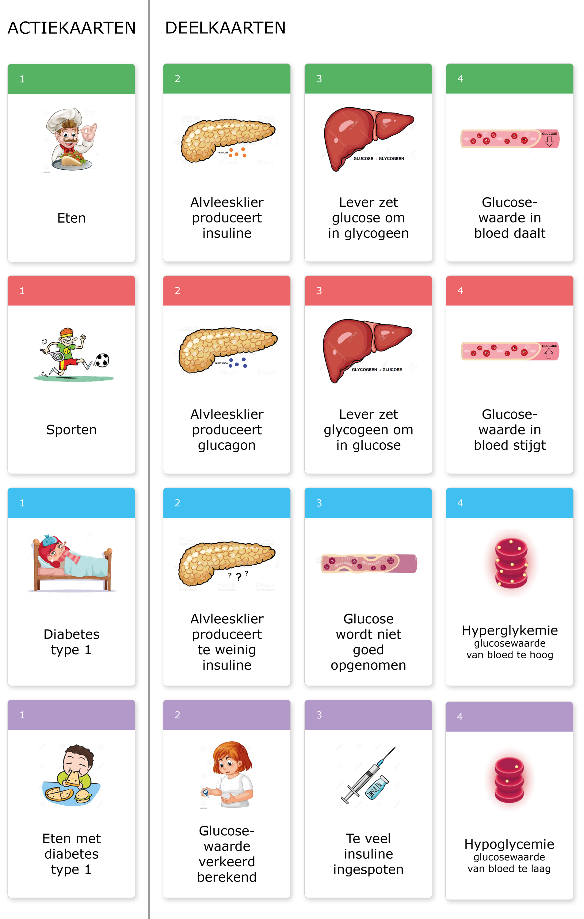
This week’s assignment was to continue with the game developed last week and deliver a production ready version. Our game is designed for a target audience of high school students and can be used in biology lessons to provide a more intuitive understanding of glucose, insulin and diabetes.
After a brief discussion with our group, we decided that I would take the lead this time. I wanted to do that, because it’s a position I’m not very experienced in and I thought it may a great opportunity to develop myself in that aspect. This worked out quite well, although I may have picked up a few more non-management tasks than would be ideal. Especially near the end of the process, I noticed it was harder to combine management with completing tasks.
The extra tasks I picked up were contributing to the documentation on the topic of learning theory (for which I had to read some documents) and making the print ready designs based on the instructions provided by my team mates. I chose to do the last task, because no one else in the team had relevant experience with this or was looking to pick it up as a skill. Since I’ve already got years of experience in the relevant tools, I knew I could make something in relatively little time.
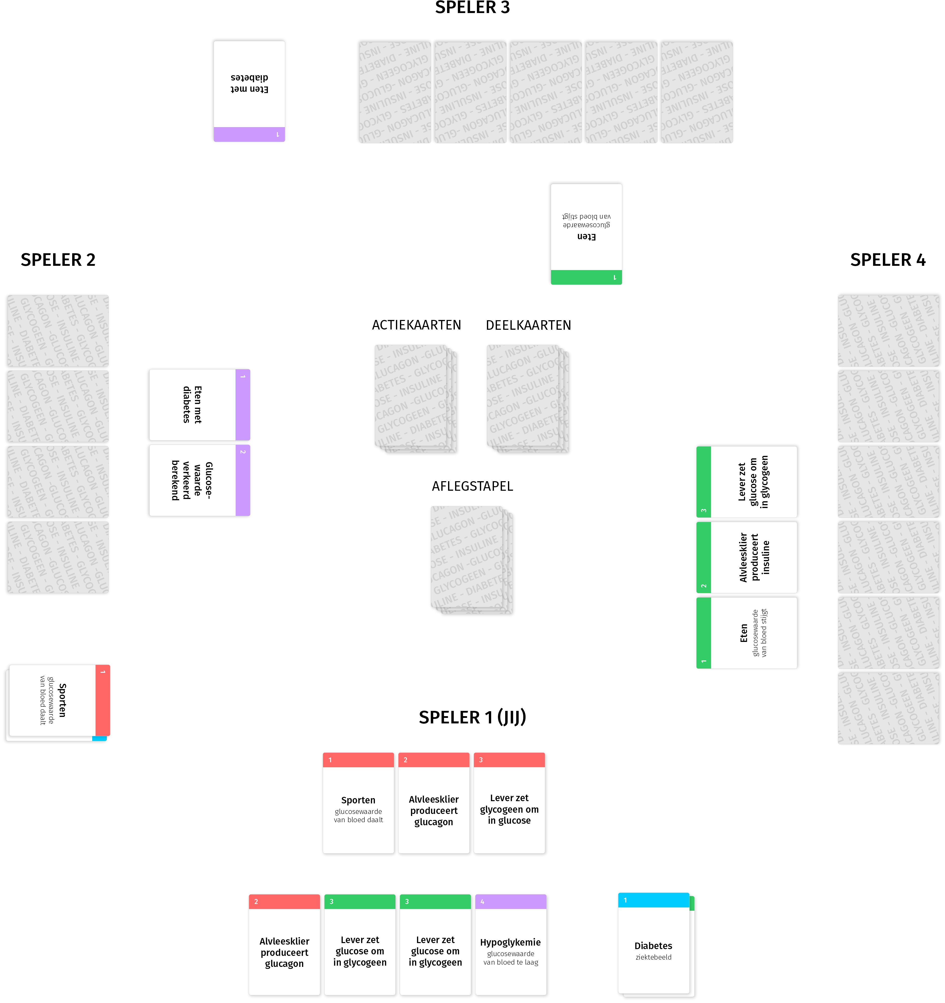
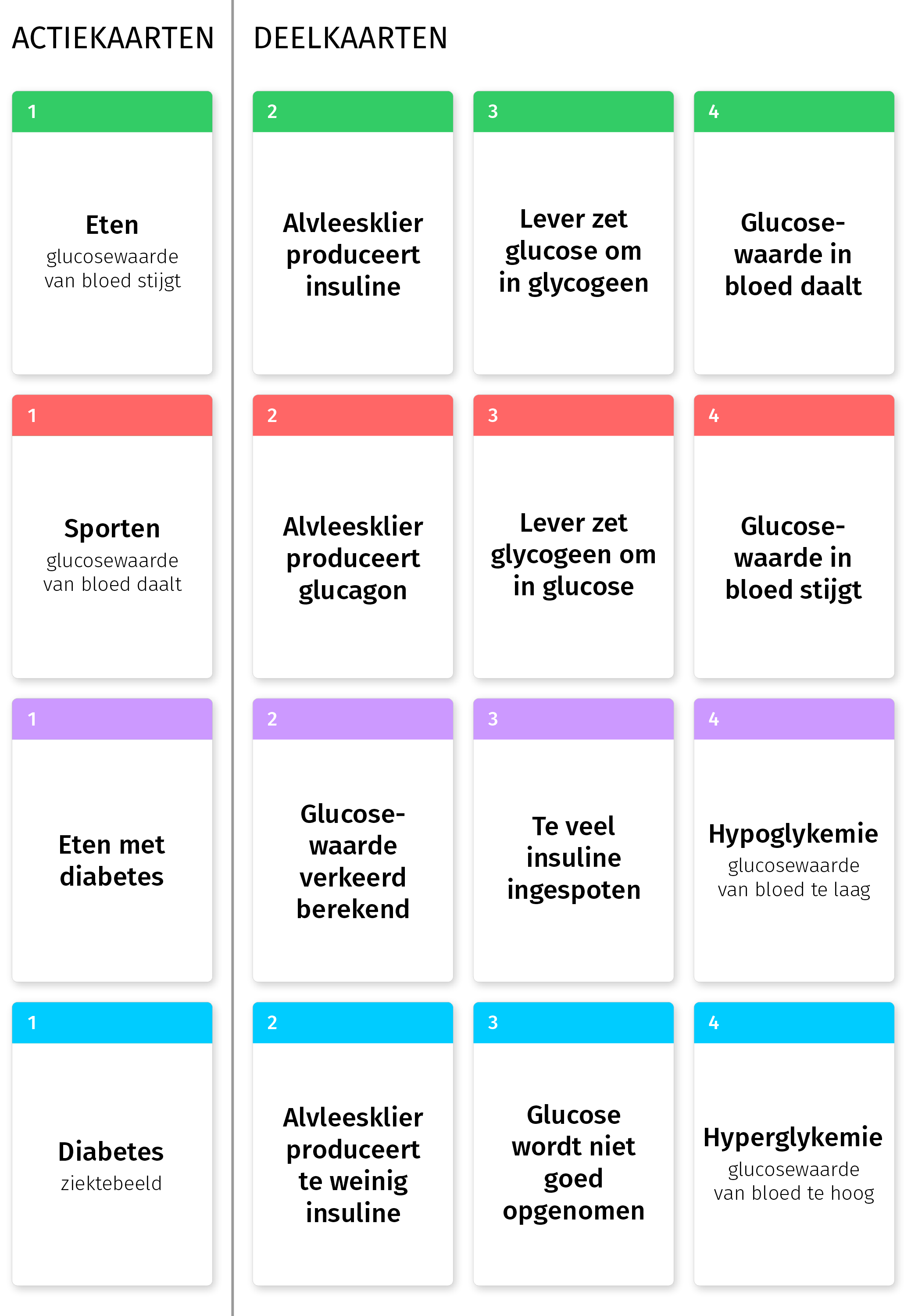
Our teamwork resulted in the following documents. The cards are also displayed in the image above.
In the end, I’m quite satisfied with the results. Unfortunately, it was hard to find free stock images that suited our needs, so we had to resort to using watermarked placeholders for now, which is something I usually try to avoid. If we had more time available, we could have drawn the images ourselves, or if we had any budget at all, we could have purchased the rights for the images. I do think we managed to produce a good looking, fun and most importantly educational game, which is a result I’m quite content with.
Read more…Martijn Luinstra 18 Mar 2021 1 comments
After having tested a gamified learning experience in class, we got tasked with designing one ourselves. I teamed up with Iris, Jari and Veerle, so we had a team of three biologists and one computing scientist. We settled upon the following roles:
Before we could design a game, we first needed to find a scientific concept or process to convey. We explored a plethora of biology and computing science topics in a brainstorm session, and eventually picked the blood sugar level as this resulted in the most concrete ideas when brainstorming. Our game is designed for a target audience of high school students and can be used in biology lessons to provide a more intuitive understanding of glucose, insulin and diabetes.
The game play is inspired by the game of quartets, but different in execution. There are 4 sets of 4 cards that describe a process related to the blood sugar level or diabetes, and the player needs to collect the cards to complete the processes.
The cards and rules are displayed below (in Dutch) and a visualisation of a possible state of the playing field is displayed above.
Read more…Spelregels
- Het is de bedoeling om zoveel mogelijk reeksen, bestaande uit totaal 4 kaarten, te voltooien. Je moet de kaarten op volgorde van nummer opleggen (eerst 1, dan 2, dan 3, dan 4).
- Er is een stapel ‘actiekaarten’ (eten/sporten/eten met diabetes/diabetes (ziektebeeld)) en een stapel deelkaarten.
- Voorafgaand aan het spel krijgt iedereen 4 deelkaarten.
- Pak een actiekaart van de stapel (nummer 1).
- Heb je nummer 2 van deze reeks zelf? Leg hem aan. Zo niet, dan mag je één eigen deelkaart ruilen met die van een andere speler óf met de stapel (dan weet je niet wat je krijgt).
- Probeer nu de reeks af te leggen.
- Als je een reeks compleet hebt, dan houd je de actiekaart zelf en gaan de deelkaarten naar de aflegstapel.
- Als je er niet in slaagt om de reeks af te leggen gaat de beurt naar de volgende speler.
- Als je een reeks compleet hebt afgelegd, pak je in je volgende beurt een nieuwe actiekaart.
- Aan het einde van je beurt moet je minimaal 4 kaarten in je hand hebben: je moet dus bij pakken als je te weinig hebt. Deze kaart(en) mag je pas de volgende beurt inzetten.
- Het spel eindigt wanneer de actiekaarten op zijn. De persoon met de meeste afgeronde acties heeft gewonnen.
Martijn Luinstra 11 Mar 2021 3 comments

After a brief discussion, we concluded that in our – potentially slightly idealistic – view, science is essentially about the search for answers. In this journey, there is no defined path or destination and even when you think you’ve found your answer, your findings will likely still be challenged by new insights. The whole process is filled with wonder, excitement and astonishment but also confusion, frustration and disorientation.
To convey this, we decided to take a slightly artistic approach. Rather than providing an exhibition with a lot of objects and text that the visitor can learn about, we wanted to provide an experience that conveys these feelings of wonder, excitement, confusion etc. In our exhibit, the room is left empty with only a big (2 metres tall) red 3D question mark in the centre, which is covered in words that hint to the questions a scientist may ask in their endeavour, see also the image below. The walls are covered from the floor to the ceiling with a sparsely coloured, but mostly black and white “discovery” map.
The visitor is invited to look at this map and find things that spark their interest. They can find their own version of the story and maybe even discuss their interpretation of the depicted events with other visitors. The map is peppered with words that invoke feelings and ideas about the scientific process, but
We had some discussion about this map. It’s not a treasure map, since we don’t prescribe a route or destination. The map should be cluttered and bursting with activity, almost like a “Where is Waldo” print. But even that is too prescriptive, every part of the map can be relevant to the story. Our map would probably be reminiscent of the jigsaw puzzles by Jan van Haasteren on which something is happening on almost every piece. Even though there might be an overarching theme, there is rarely a single most important event and one will discover new details every time they make this puzzle.
To aide our process, I made a rough sketch of a small segment of the “discovery” map, displayed above. I did this around the word “Eureka!?” as this is an expression that many people associate with scientific discovery, but added a question mark to express some doubt. Having this sketch was really useful for making design decisions and testing them. My team mates used this to formalise our design in a document, which is included below ( …
Read more…Martijn Luinstra 4 Mar 2021
This week, we had to turn the infographic from the last assignment into a “live poster.” We decided to make a “poster” that would promote the infographic itself and lure the viewer to spend some time learning from the infographic. You can think of the infographic-poster combination as part of an exhibit in, for example, a science centre where the poster is displayed on a screen and the infographic is printed on a wall next to it or available as a card in a bin with multiple infographics.
This choice dictated that we limited the information on the poster to a minimum and therefore we highlighted only a small part of the protein synthesis process. The poster itself leaves a many things unexplained, and only teases the availability of more information with a simple call to action.
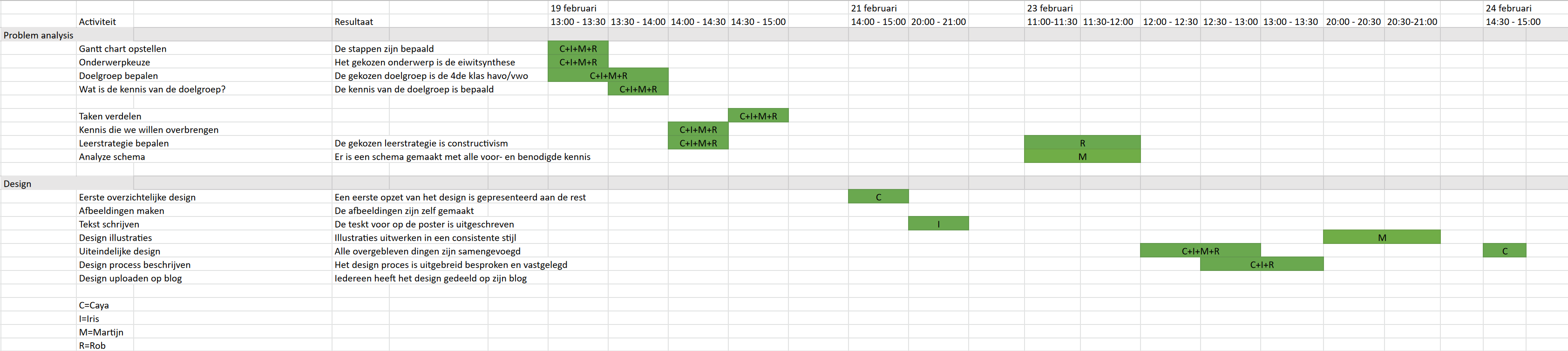
Working on this poster provided a great opportunity for me to spend some more time with the tools I’m learning: Blackmagic Design’s DaVinci Resolve and Fusion. In de mean time, my team mates worked on a storyboard, sound effects and writing down the theoretical base of our approach and process. This description (in Dutch) and a GANT chart are included below.
We’re very happy with the result. The use of animation and sound effects is a great way to draw attention to our topic. Working on this with our group was a lot of fun, we had a great time.
Read more…Designproces
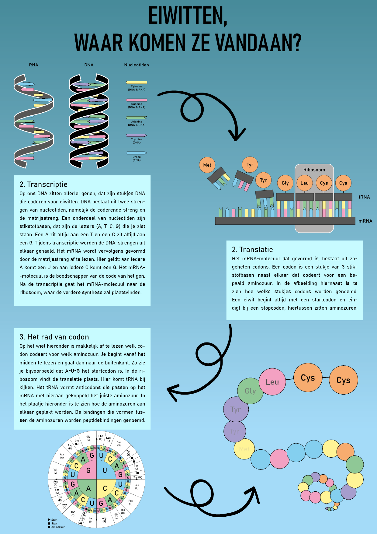
Toen we aan deze opdracht begonnen, hebben we vrij snel besloten dat we maar 1 onderdeel van onze infographic zouden gaan belichten. Dit was voornamelijk zo omdat ons onderwerp van de infographic, de eiwitsynthese, erg uitgebreid was. Uiteindelijk hebben we ervoor gekozen om op het codonwiel in te zoomen en te laten zien dat vanuit het codonwiel de verschillende aminozuren voortvloeien.
Het hoofddoel van onze levende poster is niet om informatie te geven over het onderwerp, maar om mensen te trekken naar onze infographic. Als ze dan de infographic bekijken, dan krijgen ze ook de kennis. Het idee hierbij is om op de plek waar de levende poster te vinden is, ook een bak neer te zetten met de infographics, zodat de informatie voor het grijpen ligt.
De levende poster is ontworpen aan de hand van een aantal punten uit de learning theory van Mayer. Het eerste principe is het voorkomen van cognitieve overvloed: onnodige plaatjes, woorden en geluiden moeten zoveel mogelijk weg worden gelaten. Dit is de reden waarom wij hebben gekozen om maar een klein deel van de eiwitsynthese te belichten. Hierdoor zijn er maar weinig afbeeldingen nodig en deze leggen zichzelf eigenlijk al grotendeels uit. Er zijn alleen geluiden toegevoegd die de poster aantrekkelijker maken.
Het tweede principe gaat in op het uitlichten van de belangrijkste punten: …
Martijn Luinstra 25 Feb 2021 4 comments
For this week’s assignment, we had to choose a complex scientific topic and make an infographic about it. We chose the topic of protein synthesis, as this resonated the most with the shared interest of our team, consisting of Caya, Iris, Rob and me. I hadn’t visited this topic since high school, but that provided a nice opportunity to revisit the topic and to learn from my peers.
To schedule the work, we created a GANTT chart, which got later updated to reflect the actual time spent on the project.
My first task was to analyse the information we wanted to convey, and create an instructional analysis chart. In our case, we assume students know what DNA is and what proteins are. This resulted in the chart shown below.

After that, we got together again to combine our individual efforts into the final product. I had some time left and we decided I could use that to make our own versions of the images we wanted to include in the infographic. This would create a more consistent looking final product. In the end, I even learned something from this: at first I had no idea how to quickly draw the (double) helix of RNA and DNA. I ended up drawing a sinusoid curve, which I applied a calligraphy effect to, that made the curve look like a ribbon. I could then create the 3D effect (or maybe 2.5D in this case) by cutting the curve at the minima and maxima and changing the order of the individual segments.
Caya, who is learning Adobe InDesign, combined the illustrations and text into the final infographic shown earlier. My team mates summarised the design process in a separate document (Dutch), which I recommend reading if you want to get more insight in the process.
It was a lot of fun working with such a diverse group on a topic I hadn’t looked into for so long. We had some interesting disagreements and subsequent discussions on what information was important to include in the final product as a result of this diversity. This provided some great insights in the information we worked with and ultimately led to a better product.
Read more…Martijn Luinstra 18 Feb 2021 4 comments
“Design a poster to explain the science behind the Science LinX exhibits to the visitors of the Bernoulliborg.“1 That was the assignment I worked on with Thomas and Anne-Marije this week. Science LinX has a permanent expo at the entrance of the Bernoulliborg to showcase the research done at the Faculty of Science and Engineering. Unfortunately, only 10% of high school students can explain the science behind the exhibits after their visit, or at least that was the premise of the assignment. The client wanted an easy to produce solution for providing more background information, in the form of a poster.
To schedule the work ahead, we started by creating a GANTT chart that outlined the tasks ahead and the time we expected to spend on them.
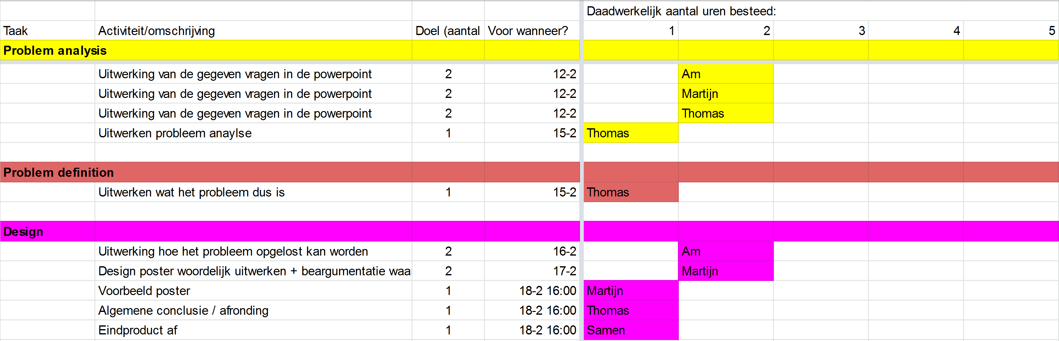
We then proceeded with the problem analysis and soon realised that a poster might not be the most fitting solution. After consulting with the client, represented by Ferdinand, we eventually concluded that a poster would be the best solution considering the budget and resource constraints.
With the problem analysis done, we proceeded to design some wireframe sketches. This helped us get a feel for the information we wanted to fit on the posters and what would be the best way to lay it out.
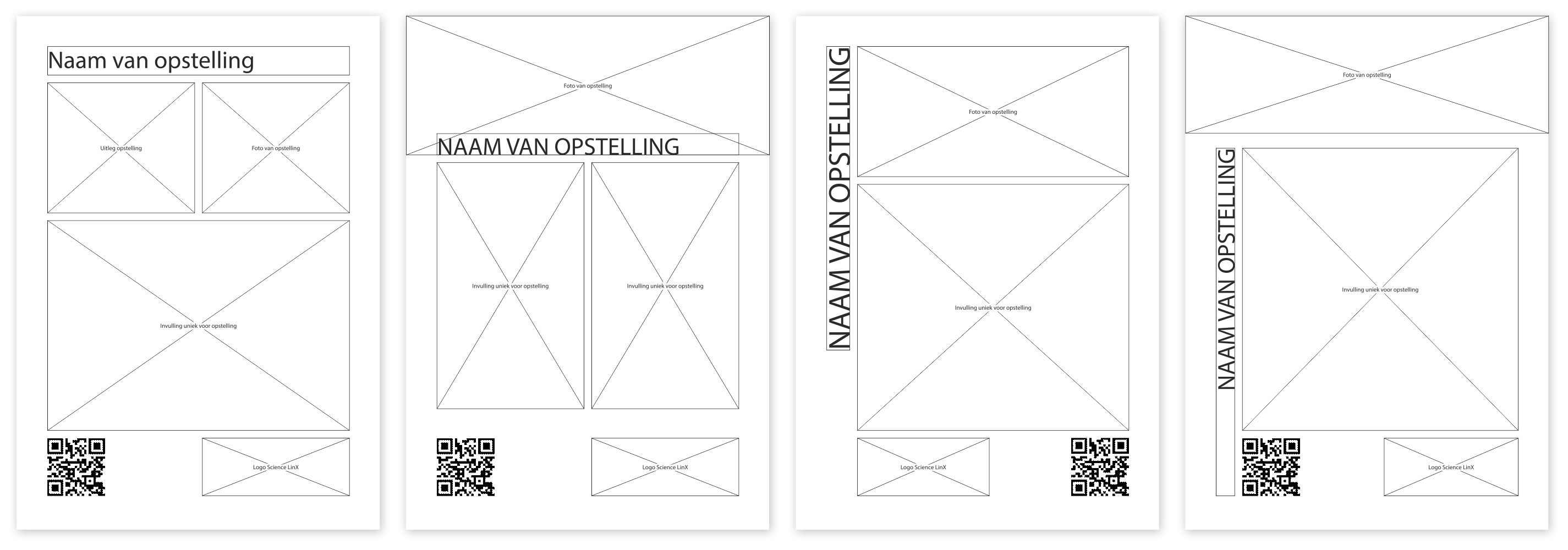
Finally, we designed a prototype/example poster for the MindBall exhibit based on one of these sketches. To make something that would go well with Science LinX’s other communication, we based the design on a folder we found on the Science LinX website. As a placeholder for the actual contents of the poster, we used the description of the exhibit provided on the same website.
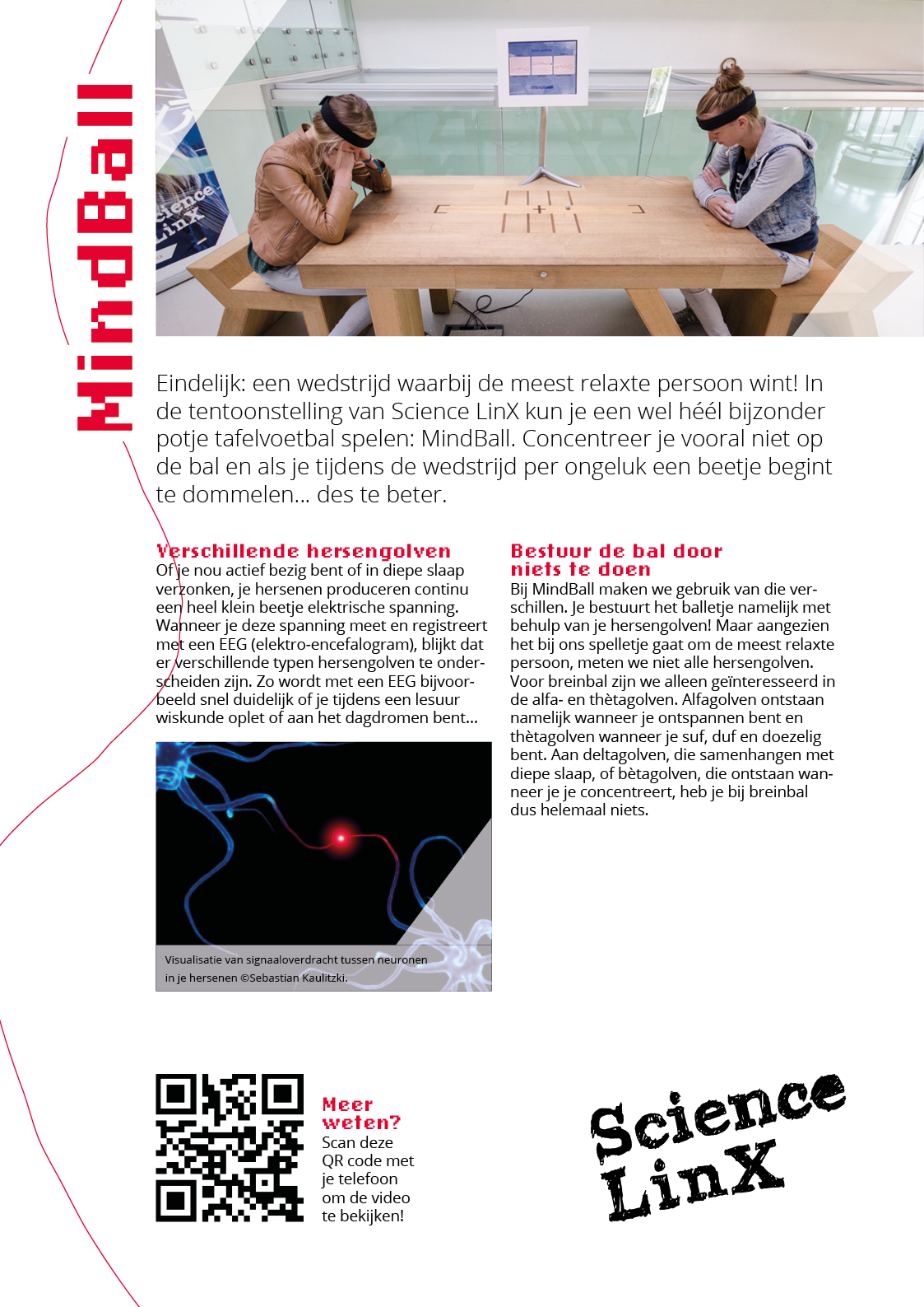
In the end, we’re quite satisfied with the result. We have extensively documented our findings and process in our problem analysis document, which is available online just like a pdf file of the poster.
Read more…Martijn Luinstra 11 Feb 2021 2 comments
For the first assignment, I had to make a video explaining why I love science and what gets me excited for my discipline.
The story I wanted to tell was how I got interested in computers as a child and why I’m still excited about their potential after so many years. From the beginning, I started thinking about the visuals that would accompany the video. One of my ideas was to include the old “word art” feature of Microsoft Word, that is still cherished by many and the old Solitaire that was included in early versions of the Windows operating system for which I knew I still had the binaries lying around on a hard drive.
When trying to write the script, I got distracted by collection footage of the Solitaire game for a lot longer than I should have. This took a much bigger chunk of my time budget, so the rest of the project unfortunately turned into a rush job.
To save some time, I combined writing the script with filming myself working on my laptop. I quickly collected the other footage using the screen capture tool built into Windows 10 and finally stitched everything together using DaVinci Resolve, a video editing application that I have some limited experience with.
In the end I’m not really satisfied with the result. I wish I finished the script quicker and wouldn’t have wasted time on collecting a few seconds of footage from an old game (and getting distracted by it). That way, I would have been able to spend much more time collecting interesting imagery to accompany my story, and I could maybe even have found some music to tie it all together.
There are still a few things I like about the video. I’m quite happy with the way I integrated the script into the footage of Microsoft Word, even though the timing is a bit off. The part I like the best is where the images shown to illustrate applications of data science, are revealed to be search results, which ties in with the final part of the story.
Maybe I will revisit this project some day, making sure I won’t waste my time on playing a virtual card game.
Read more…Martijn Luinstra 10 Feb 2021
Short answer: No.
Long answer: No, but maybe next time?
Please allow me to elaborate. I was given the assignment to set up a blog for a course I’m attending, with one important constraint – take no longer than 2 hours to pick and personalise a CMS (Content Management System, the platform the blog is published on). For about five years or so, I’ve been toying with the idea to start a blog and build a very basic CMS for it as a web-development exercise. Just the will to publish some thoughts wasn’t enough to actually execute this plan, it turns out. So when I got tasked to setup a blog, I couldn’t resist the temptation. After all, my web-development skills have vastly developed since I first considered to start this project years ago. It would be tight, but it didn’t seem unreasonable to think I could do it in two hours.
A former co-worker of mine once told me to always multiply time estimations for programming tasks by π. Once again, they were right. Or so I think. I stopped tracking time when it became clear that two hours was not going to work and I rebranded the endeavour as a “weekend project.” For all intents and purposes, I could have written the code half a decade ago and just have refreshed the design to fit this assignment in an hour or so. That would have worked. The design part of this process was done well within the time budget – made easy by the minimalist style I went with, but that was not intended as a time-saving measure. I think I even have enough time left over, multiplication by π included, to implement a comment system.
The CMS is a simple Markdown based system written in PHP. I didn’t need any fancy user interface, since I speak computer and I generally prefer writing Markdown in my text editor of choice over using whatever rich-text editor the platform provides. Functionally, this CMS is not too dissimilar to a non-static version of Jekyll. It finds Markdown files on the file system and renders their contents using a simple PHP framework I built a couple of years ago in a similar learning experience turned weekend project episode. The basis for this system was indeed easy and within half an hour I had a system that would render Markdown files as I intended.
Well, I wanted to make things fancy. I decided I needed to have pretty URL’s that only loosely correspond to paths on the file system, I needed the ability to host media along side the blog posts and I wanted to customise the Markdown rendering. Eventually I ended up learning new things about NGINX, switched to a completely different markdown renderer, rewrote parts of the code more than once and completely over engineered the thing. Next time, it’ll be a lot easier and I may actually be able to do it in two hours. But then again, I could just recycle this project.
All things considered I still think it was wor …
Read more…